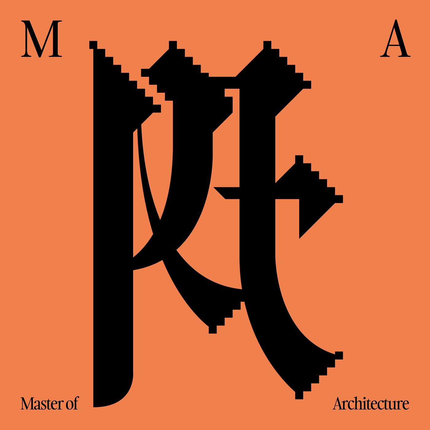
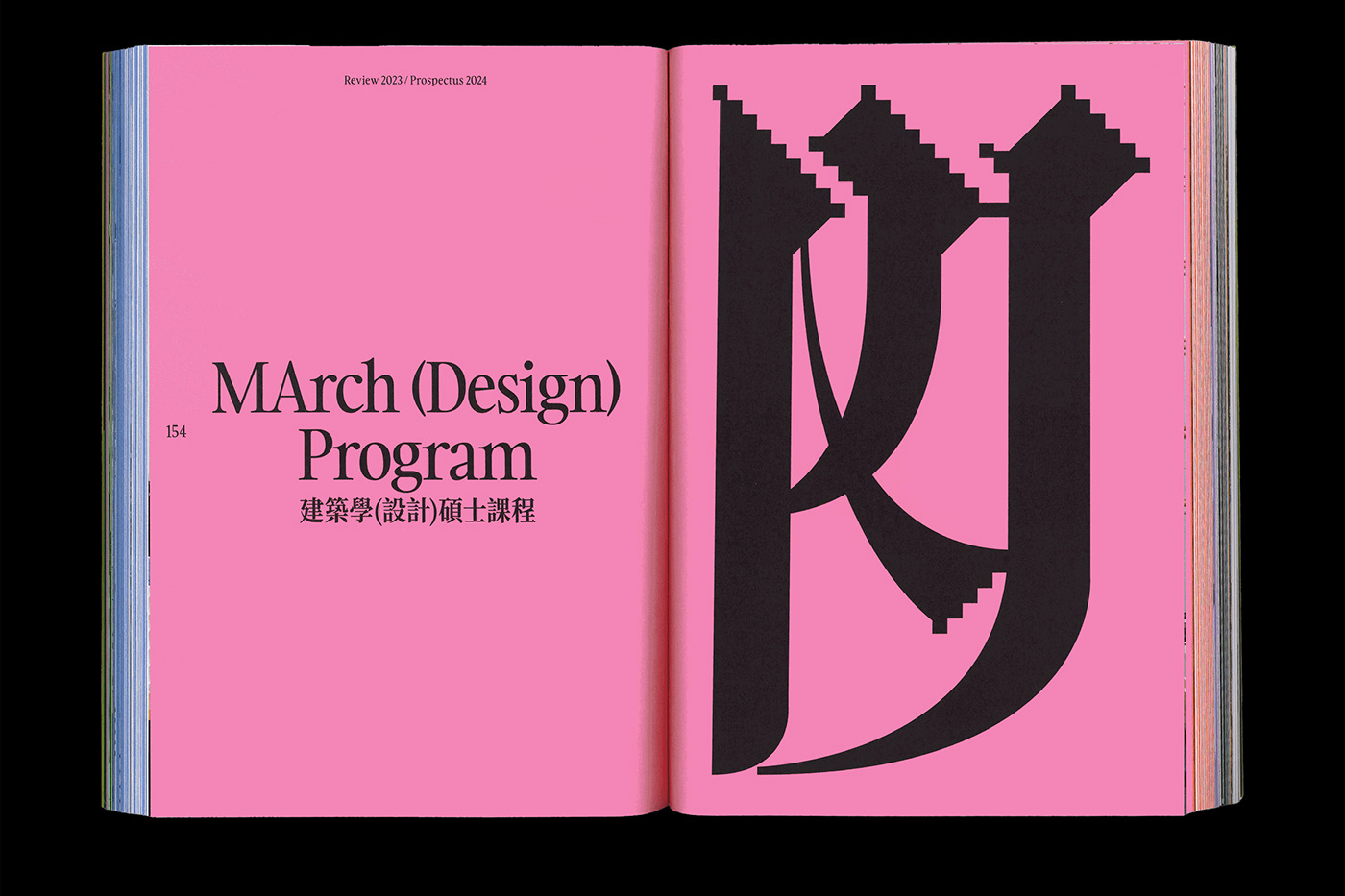
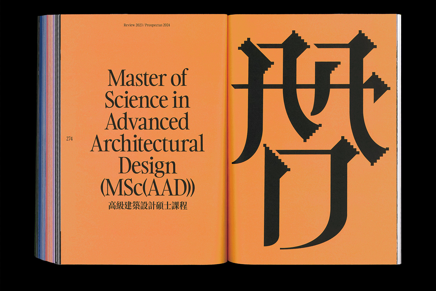
A set of custom-made glyph was created for the HKU Department of Architecture Review 2023 / Prospectus 2024 booklet as the cohesive visual anchors binding the contents of this 280-pages book. Based on strokes inspired by the commonly seen Chinese Hanzi / Japanese Kanji / Korean Hanja serif typography style — Ming-ti / Song-ti / Mincho (明體 / 宋體 / 明朝), the intention is to generate amalgamation of letters using Chinese strokes to perform the Latin ligatures or symbols of acronym, creating a set of ambiguous yet informative glyphs migrating into various language backgrounds and cultures, resonating the inclusive and versatile teaching and learning environment in HKU.
Typeface in use —
Gambarino designed by Indian Type Foundry